Product Release Notes - November 2025: The details that make everything better ✨
November's all about the upgrades you didn't know you needed—until now.
📊 Data & Reporting: Making numbers work for you
We understand that numbers matter. Behind every great presentation is data that tells the real story—and that data should be easy to work with.
Excel reports just got way more useful
What changed:
Your participant info now lives in its own separate columns—one column per field, with headers that actually make sense. No more wrestling with JSON data just to see who attended your session.
The technical bit: We kept the original JSON column too, so if you've built fancy formulas around it, nothing breaks. Best of both worlds.
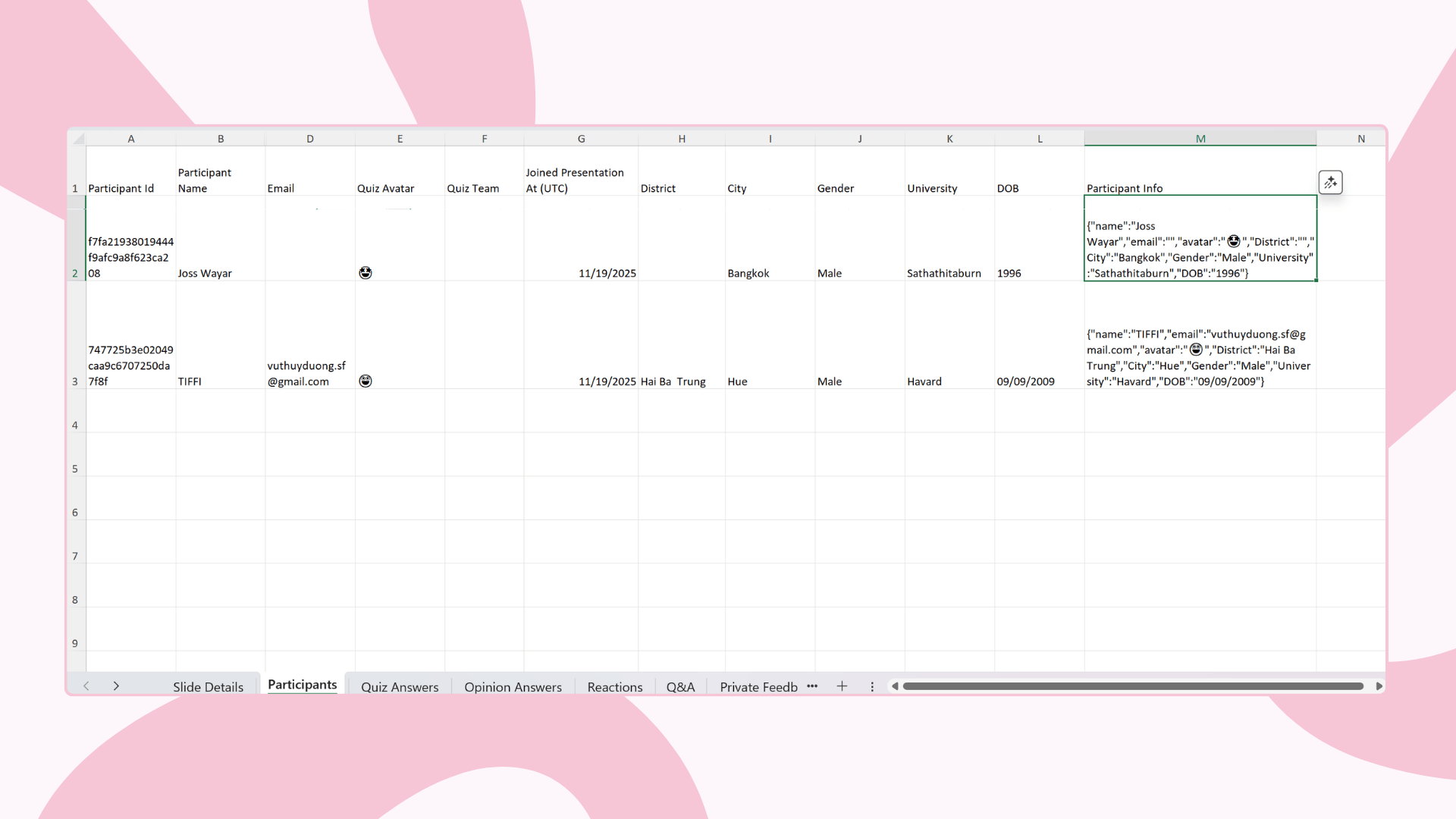
One more thing: We streamlined our reports. There's now just one report version (v5) that's ready 5 minutes after your presentation ends. Clean, fast, and everything you need.
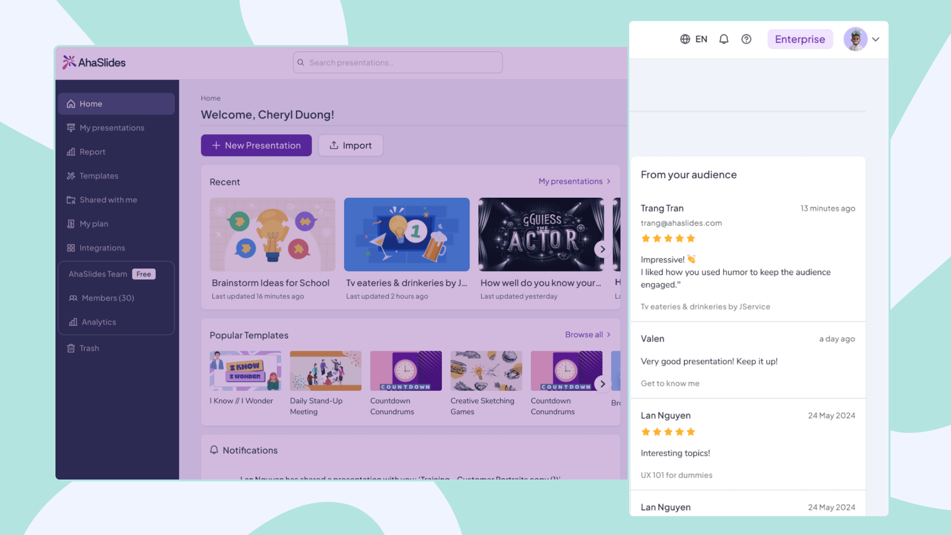
Feedback visibility upgrade
Your Home feed now shows feedback from all your decks—the ones you created, edited, and presented. Everything in one place, finally.
Simple change, but it means you'll never miss what your audience is telling you.
Behind the scenes: Smarter device tracking
What changed: When someone joins multiple presentations from the same device, we now recognize it's the same person.
How it works:
Each device gets a universal ID (stored in browser)
That ID connects to all sessions from that device
Past participant data gets automatically linked when they return
Impact for you: Better analytics and reporting. We can track engagement patterns across multiple sessions without compromising privacy.

🎨 Editor Improvements: Better Control, Better Design
Give your text some breathing room
New feature: Line-height control in the toolbar.
Tight text making your slides feel cramped? Spacious text looking a bit too airy? Now you can dial it in exactly how you want it. Your content, your spacing.
Sample word clouds that actually help
Ever stared at a blank word cloud slide, wondering how it'll look once people start contributing? Not anymore.
What you'll see now: A preview with positive sample words—styled to match your theme and displayed in your application language. Think of it as a window into the future of your slide.
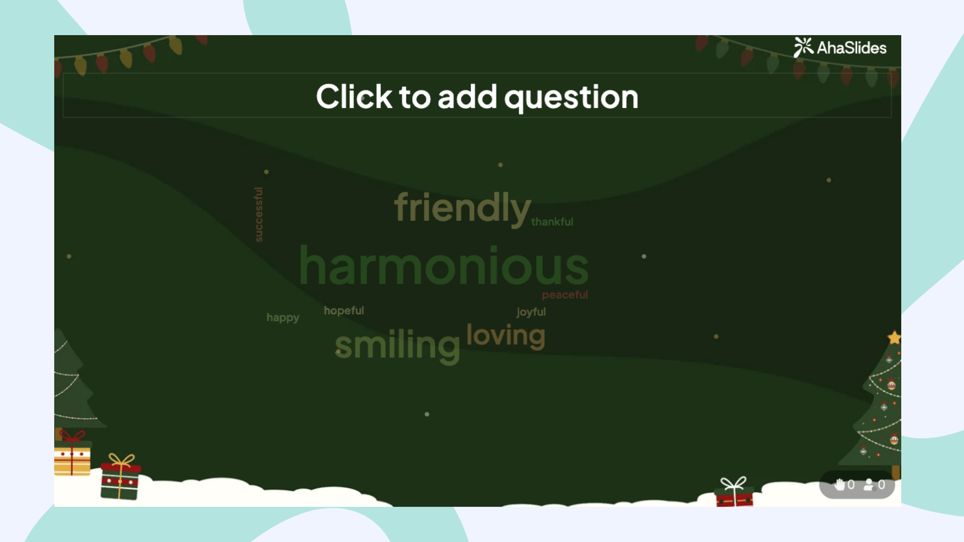
Why this matters: You can tweak your design before showtime, knowing exactly how your word cloud will appear when it's filled with real responses.

🌍 Access & Availability updates
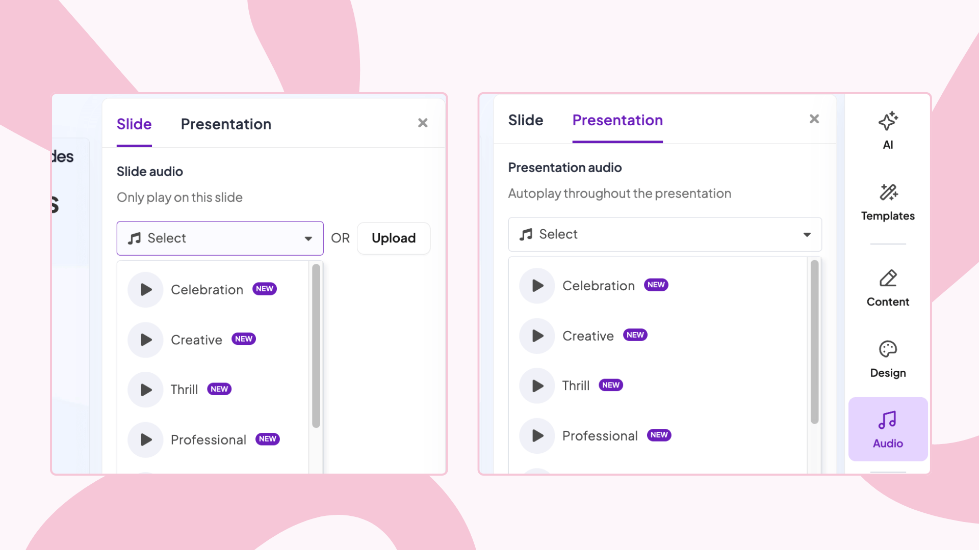
Audio feature: Now available to all paid users
We learned from some users that they were using this feature to guide students with visual disabilities through polls and quizzes. That's exactly the kind of creative, inclusive use case we want to support.
What changed: All paid plan users (Edu Small, Edu Medium, Edu Large, Essential, Pro) can now change audio for slides and presentations. This was previously limited, but we've opened it up.
Why it matters: Whether you're supporting students with visual disabilities, creating more accessible learning experiences, or just want audio to enhance your presentations—it's now available to everyone on a paid plan.
Free users, we haven't forgotten you—but this one's for the paying customers.
New language: Serbian 🇷🇸 joins the family
Dobrodošli! Serbian is now fully supported on AhaSlides—in both scripts:
Srpski (Latin)
Српски (Cyrillic)
Whether you're presenting in Belgrade or anywhere Serbian is spoken, you're covered.
🔧 Bug Fixes & Technical Updates
Audience app history: Fixed
The fix: Participants can now view their presentation history directly at Live Audience Engagement Platform - AhaSlides
What was broken: The "sign in as participant" flow from the Presenter app wasn't showing the Profile tab correctly. Now it only hides when you intentionally hide it in your presentation settings.
Known limitations we're working on
Due to a technical issue, we've temporarily reduced the import file size limit from 50MB to 20MB. Our team is actively working to restore the 50MB limit.
On Windows devices, AhaSlides can't currently detect Next/Back slide actions in PowerPoint, so you'll still see the "Start AhaSlides" button. The team is investigating and will fix this soon.
🔮 Coming Soon
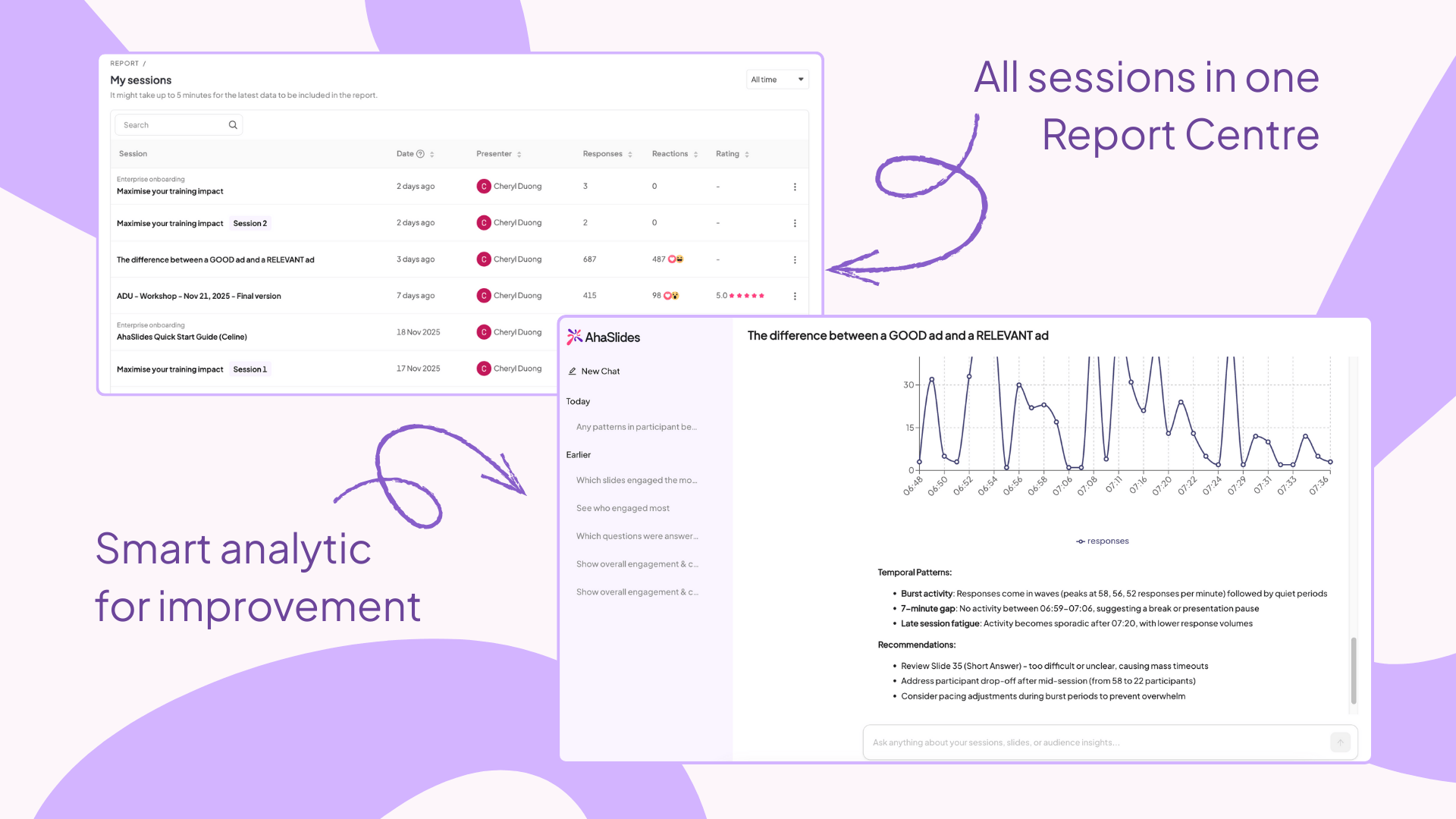
AI report & report centre — We're working on something that'll change how you understand your presentation data. Stay tuned.
🎯 The Bigger Picture
November's updates fall into four themes: better data access, smarter design tools, broader availability, and fixes that matter. Every improvement removes friction so you can focus on what counts—connecting with your audience.
Questions about any of these updates? Our support team is here to help. Send us an email to hi@ahaslides.com.
Keep presenting boldly! 🎯
P.S. — If you're using the new Excel report columns and they're saving you time, we'd love to hear about it. Sometimes the smallest changes make the biggest difference.
Topic Participants
AhaSlides Team